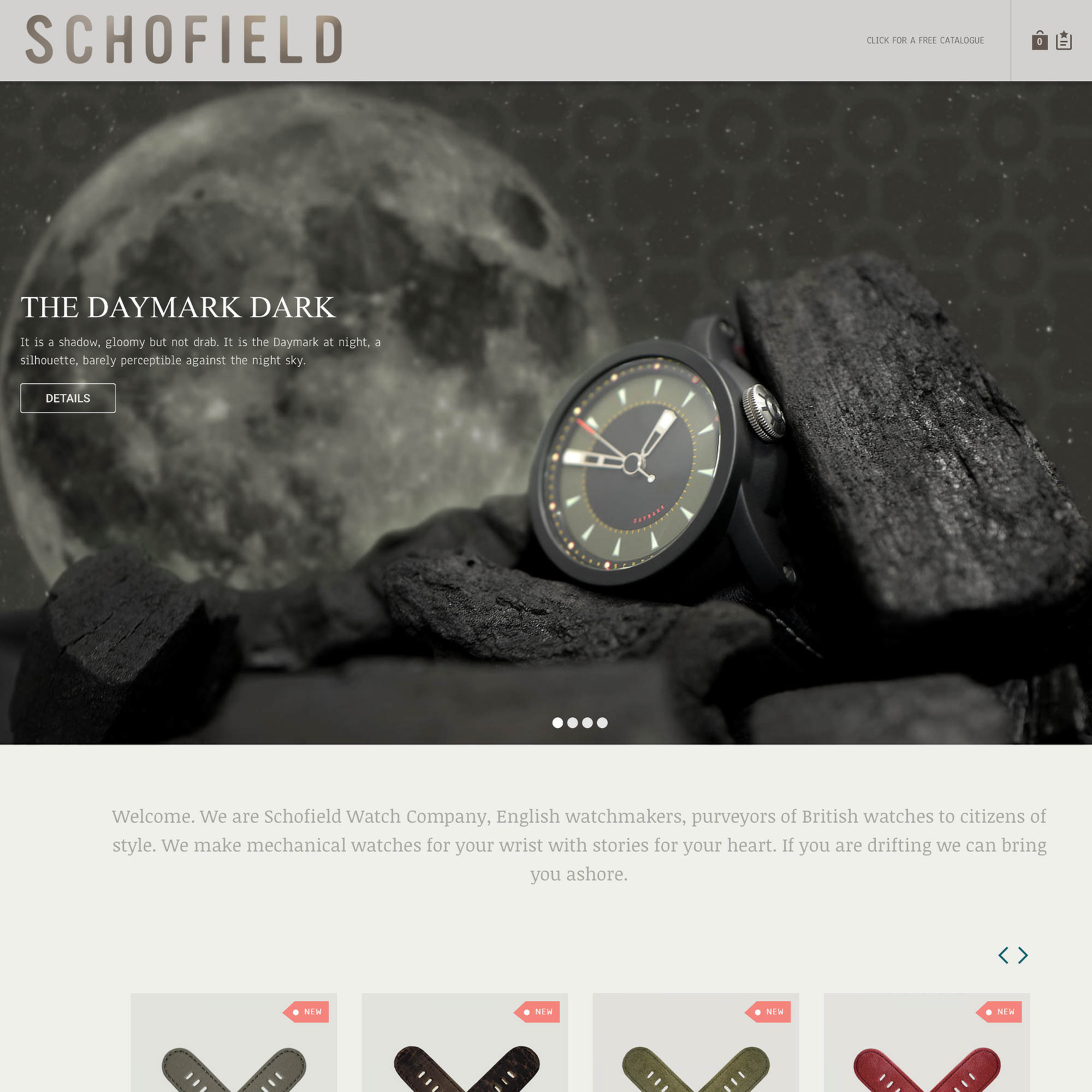
You’ll notice a few design updates. Having done ‘bright and breezy’ for the last two years, we cannot bask in the sunshine for too long. Schofield is a little more crepuscular and therefore gravitates to a more sombre palette. By now many of you have come to understand that it’s not like us to live with a logo or any graphic device for very long so we’ve made a few changes. By no means a reinvention of the wheel, these tweaks are a natural progression for Schofield, inspired by the Daymark Dark and something a little Murky which is to come.