
I Admit…
Evening all, I totally failed to get the Skeptiko online. I like to think that coffee and purpose equals laser-beam focus but, alas, like most people, I get distracted.
Instead, I’ve been writing, designing, consolidating and compiling. In other words, repairing fragmented language, icons, logos, colours and themes across the technosphere.
Good work it is too – getting one’s house in order. The fruits of which you will not notice explicitly, but your subconscious will.
I will not be doing a 20YR watch but I will do something. Perhaps a book – 20 Years of Abandoned Ideas..
Writing
It is true that I have been writing. Keenly so. I confess to not looking inside the Six Pips Almanac for two years and felt the need to for research. I was impressed. Who wrote this… was it me? If so, where did I find the time?It has aged well and I found myself muttering ‘hmm. Yeah.’There are now only 5 copies left from a run of one hundred. Almanac felt like the perfect title at the time but now I would prefer something like What Makes us Tick.The button below takes you to the Almanac page.
Good Design
–involves subtraction.
Things recently removed from the website:
- The manifesto – too much green ink.
- Accordions – they hide stuff, I do not want to hide things.
- Clutter & decoration – Schofield does not need adorning.
- Fake organisation – complex navigation and obscure categories.Clarity is the Schofield way.
Every removal made the website better. Now there is more Schofield.
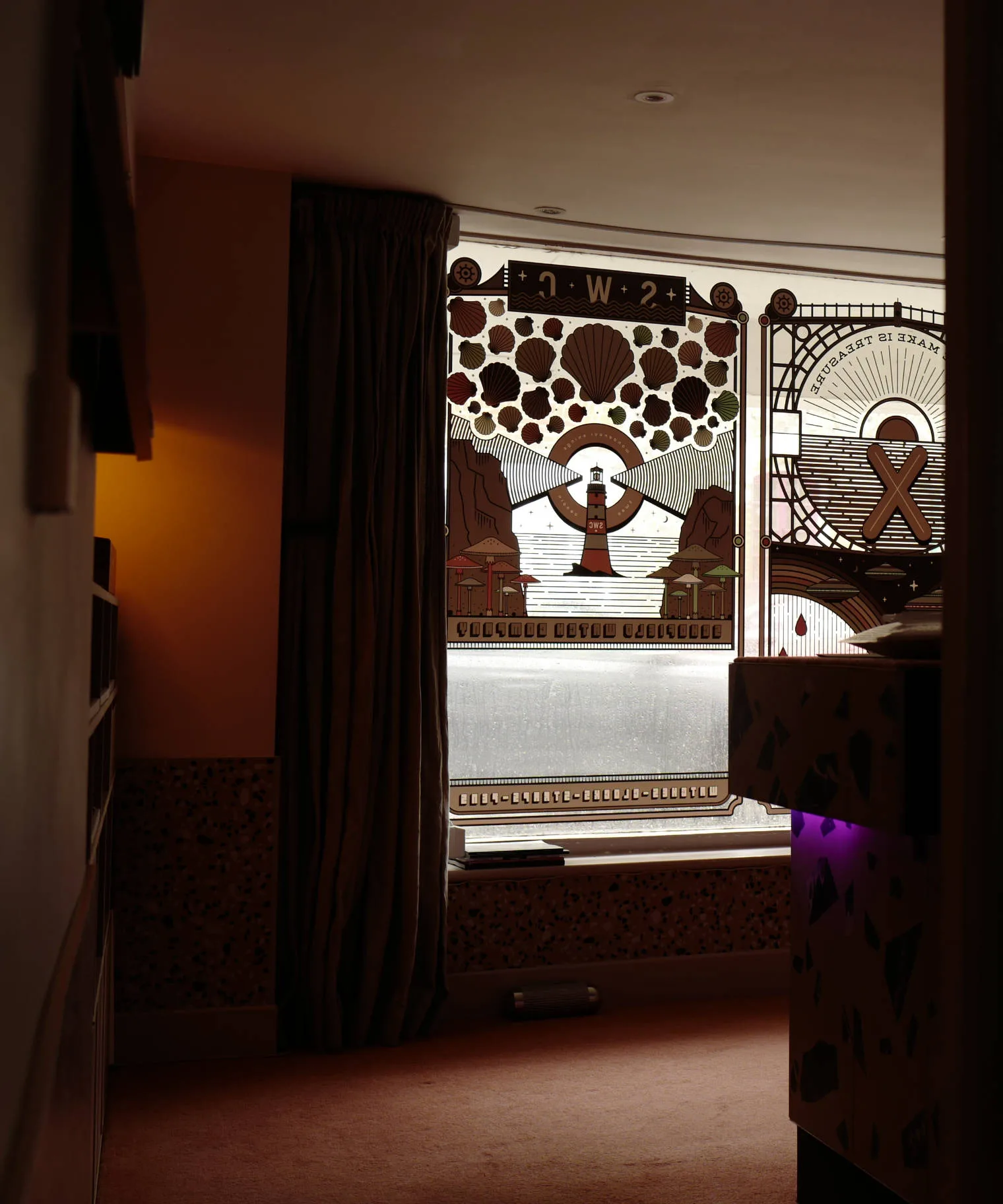
Riverside
Riverside, the shop and office where I spend much of my life.
Things visible from the window:
- Cars going too fast
- Rain
- People – all kinds
Things that make this acceptable:
Loving 90% of my work
A Magister ES40 coffee machine
Music all day – and proper HIFI for it
Pink carpet
Obscura Case Back
The case back is built around the three smoked sapphire crystals in the centre.
The three circles in a triangle is a classic Sci-Fi meme – think Predators tri-beam laser sight or a UFO undercarriage, but they also represent planets among the stars.
The fonts are interesting, obscure, one that could be Mayan, Witcher or Incal – who knows? It does not rank for legibility but is still cool.
The other shows semaphore flag positions – a contracture of the N and the D in this alphabet makes the CND logo, a masterpiece of design by Gerald Holtom done in 1958.
It is worth noting that all the detail on the case back is letters up, not down, meaning that it is the background that is machined away. It is then DLC coated and the top surface ground back to give contrast.
Peace ✦